This year could be an exciting one for Philadelphia elections, and the primary on May 15th will give us an important signal for what to expect in November. Of course, much of what happens depends on voters actually going to the polls—that is, voting.
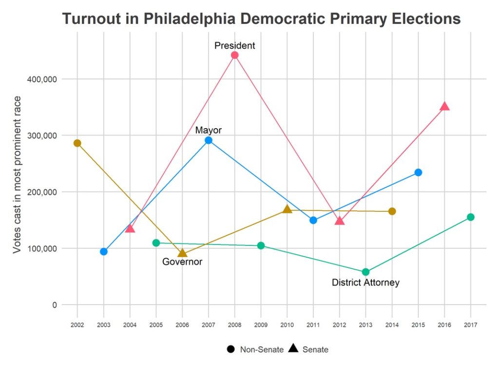
Will the hype—of more people being civically engaged, new Congressional Districts creating competitive races, people being exercised about our political situation—live up to the promise of higher turnout come Election Day? Will turnout beat the 165,000 who voted in 2014, even with a non-competitive Senate and Governor primary? Will the surge seen in 2017 continue?
That’s what Sixty-Six Wards’ new live election tracker will tell us—in real time.
To do that, I need help from you.
What I need from you
On election day, vote! When you sign in to vote, you’ll see what number voter you are in your division. After voting, go here to share with me your (1) Ward, (2) Division, (3) Time of day, and (4) Voter number. Using that information, I’ve built a model that estimates the turnout across the city (see below).
You’ll then be able to track the live election results here.
This estimation can only get better with more data points. So encourage your friends to vote, and share their voter number too. Or, if you’re an election watcher in the polling station, you can update data from your division throughout the day.
Why this matters
We make a lot of assumptions about voting, voter turnout and how to get out the vote. But we do this only with historic data—information that could be outdated, and that doesn’t necessarily reflect current neighborhood demographics or a political moment. Real time data, especially on a wide scale, could prove incredibly useful in knowing where and when to deploy people to knock on doors and get out the vote while it still matters—that is, when the polls are still open.
Could that mean the difference between a 10 percent turnout in a particular neighborhood and a 12 percent turnout? Could it move the needle even more? It’s hard to say. But given the paltry state of our voting numbers, any way to get more people casting a ballot is worth it.
The Model
For the details, formulas and specific explanations of how I’m doing the math, check out my post over at sixty-six wards.
Essentially, estimating turnout live requires simultaneously estimating two things: each Division’s relative mobilization and the time pattern of voters throughout the day. The 100th voter means something different in a Division that had 50 voters in 2014 than it does in a Division that had 200, and it means something different at 8 am than it does at 7 pm. Further, Philadelphia has 1,686 Divisions, and I don’t think we’ll get data on every Division (no matter how well we’re able to blast out the link). I use historic correlations among Divisions to guess the current turnout in Divisions for which no one has submitted data.
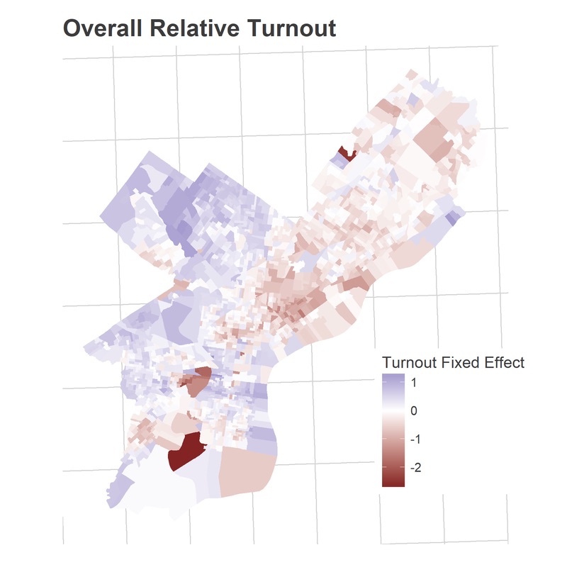
To best estimate relative turnout, especially for Divisions with no submitted data, I use historical data. Using the Philadelphia primaries since 2002 (excluding 2009, where something is weird with the data), I estimate each Division’s average relative turnout versus other Divisions (its “fixed effect”), and the correlation among Divisions’ log turnout across years. Divisions are often very similar to each other; when one Division turns out strongly in an election, similar Divisions do too.
Some note about the data collection: I only collect the four data points above (Ward, Division, Time, and Voter Number), and no identifying information on submitters. I *will* share this data publicly—again, only those four questions—in hopes that it can prove useful to others. And I am only using Democratic primary results. Sorry Republicans, but there are simply too few of you, especially in off-Presidential years, for me to think I could make any valid estimate.
Here are the estimated average relative turnouts (the fixed effects):
We see a familiar pattern. Center City, Germantown and Mount Airy, and Overbrook all vote at disproportionately high rates, while the universities, North Philly, and the northern River Wards vote at disproportionately low rates.
That’s across all years. But the way Divisions over- or under-perform these averages in a given year creates patterns as well. Divisions’ turnouts are correlated with each other.
Calculating patterns from the past
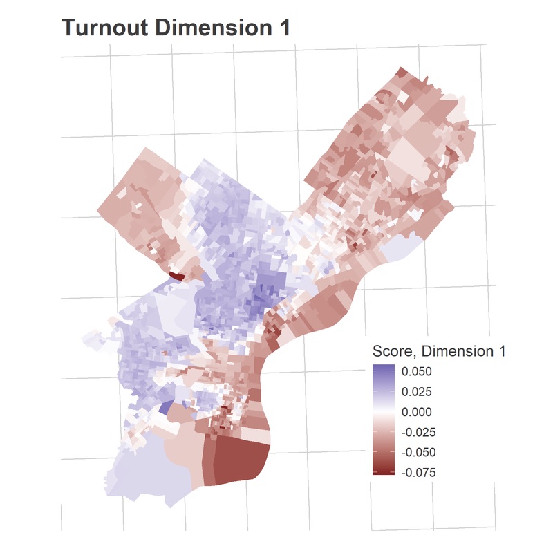
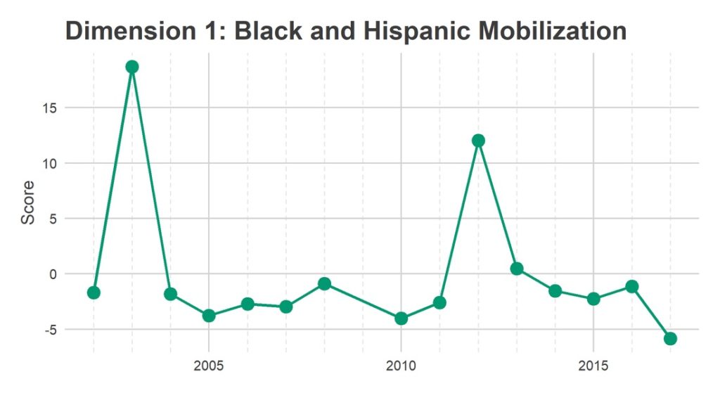
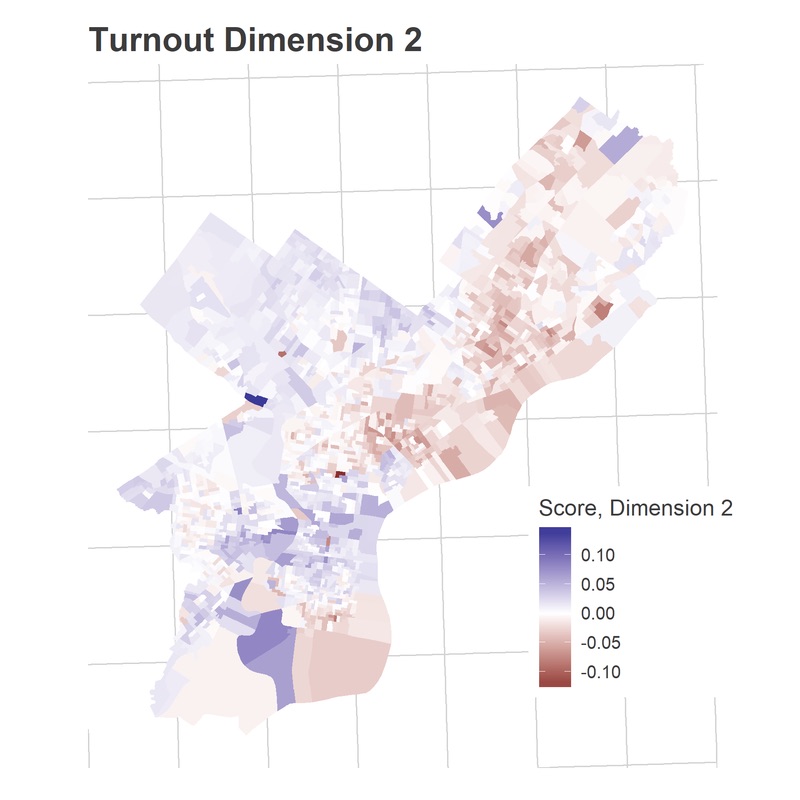
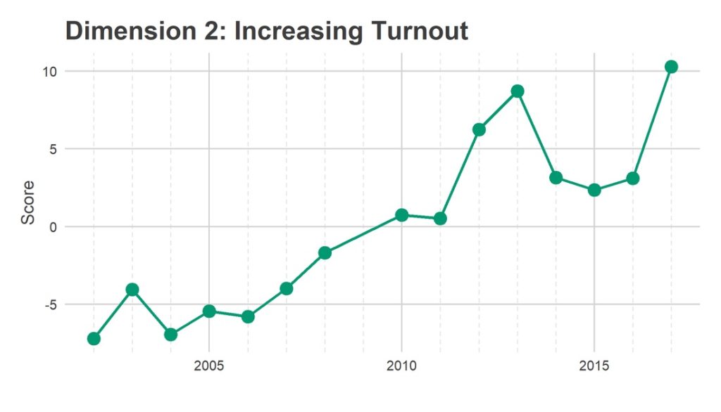
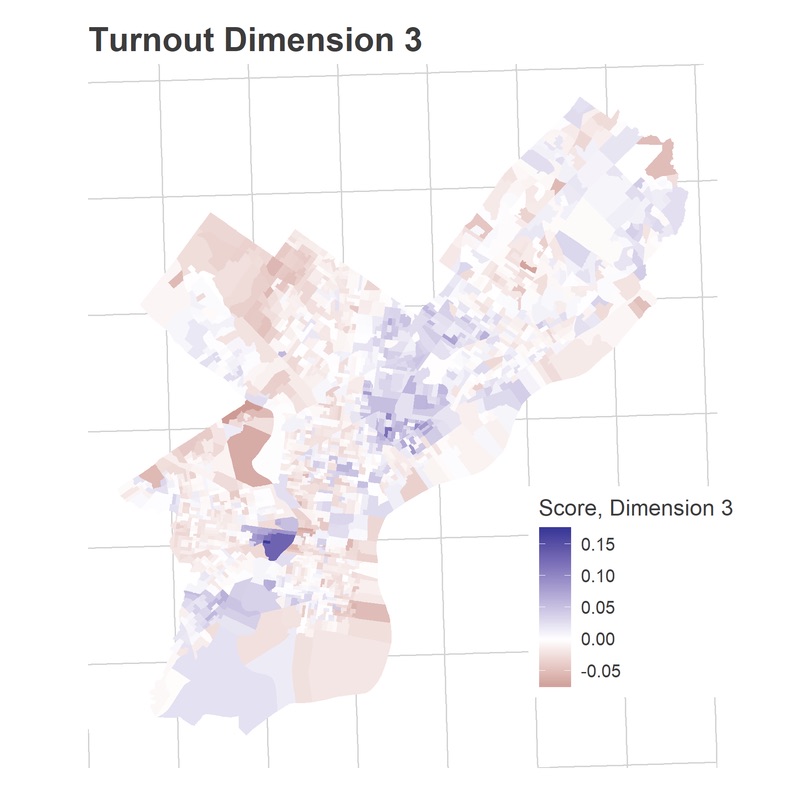
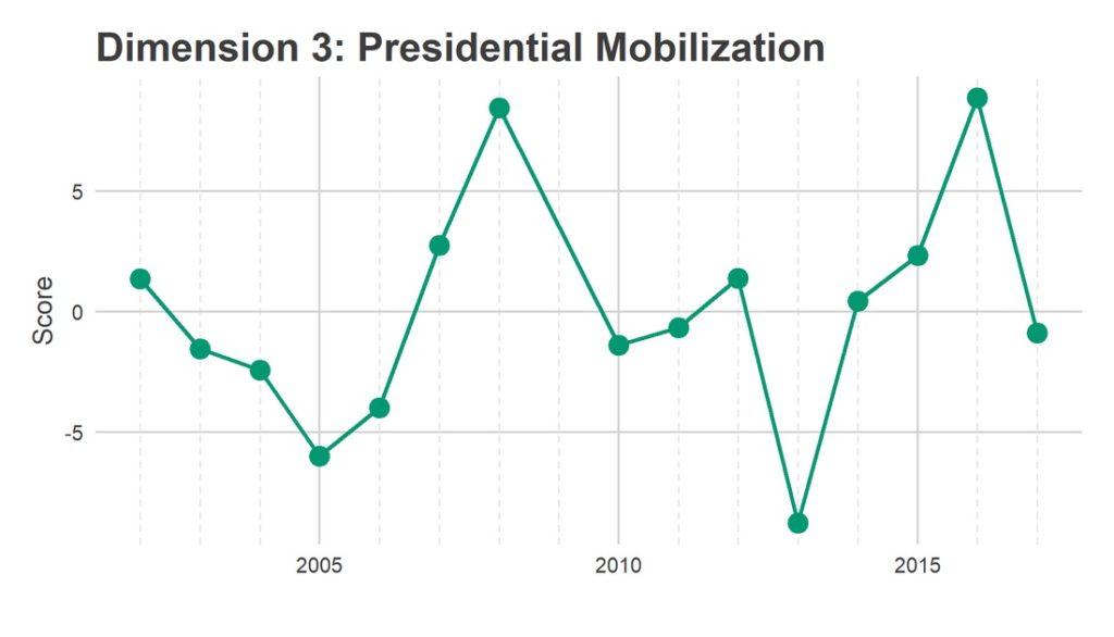
I looked for divisions that moved together in different elections, and called them “dimensions.” I identified three dimensions of turnout: Black and Hispanic mobilization; increasing turnout over time; and Presidential mobilization. These dimensions represent groups of Divisions that swing together; when one Division in the group turns out higher than usual, the others do too, and vice versa. Using an algebraic technique called Singular-Value Decomposition (SVD), I assigned each division and each year a score in each dimension. Divisions with positive scores in Dimension 1 turn out strongly in years with positive scores in Dimension 1, and vice versa.
Eyeballing the score maps together with the years’ scores serves as a sanity check for years, and provides intuition to the underlying story.
Looking at the map, Dimension 1 has clearly identified the racial divide in the city. The blue divisions line up with Philadelphia’s Black and Hispanic neighborhoods, the red divisions with its White Non-Hispanic. The time series shows that all of the blue divisions on the map turned out higher than average in 2003 and 2012—for the reelections of Mayor Street and President Obama. Meanwhile, the greatest disproportionate turnout in non-Hispanic white neighborhoods was for last year’s 2017 District Attorney’s race.
It’s less obvious from the map what Dimension 2 captures, but the time series is clear: Dimension 2 identifies Divisions where relative turnout has steadily increased over the 16 years. This also lines up with the neighborhoods that have gentrified: Powelton, Fishtown, Fairmount, and Girard Estates have seen the strongest trends up, while broad swaths of North Philly and the Greater Northeast have seen relative decreases over time.
Dimension 3 identified Divisions that surge in turnout specifically for Presidential primaries. Penn and Drexel see the strongest swings, though Southwest Philly and Hispanic sections of North Philly also have positive scores; these neighborhoods voted strongly in 2016 and 2008, relative to their typically low overall turnout.
See you on Election Day!
Jonathan Tannen is an urban demographer who operates the blog sixty-six wards, where this analysis originally appeared.
Header photo: Phil Roeder, via Flickr


