


Last Monday, the U.S. Supreme Court made a unanimous decision to reject state Republicans’ efforts to block the new Pennsylvania congressional district map from going into effect for the upcoming May primary. That means Philadelphians should start getting to know the new map—and its implications—before heading to the polls this spring.


Using data from the Open Elections Project, I’m profiling each of the region’s new Congressional Districts, exploring who the residents are demographically, and how they voted in past elections. (For more information on methodology, see the note at the bottom of this piece.)
Learn everything you need to know about District 1 below. Read about District 2, District 3, District and District 5.
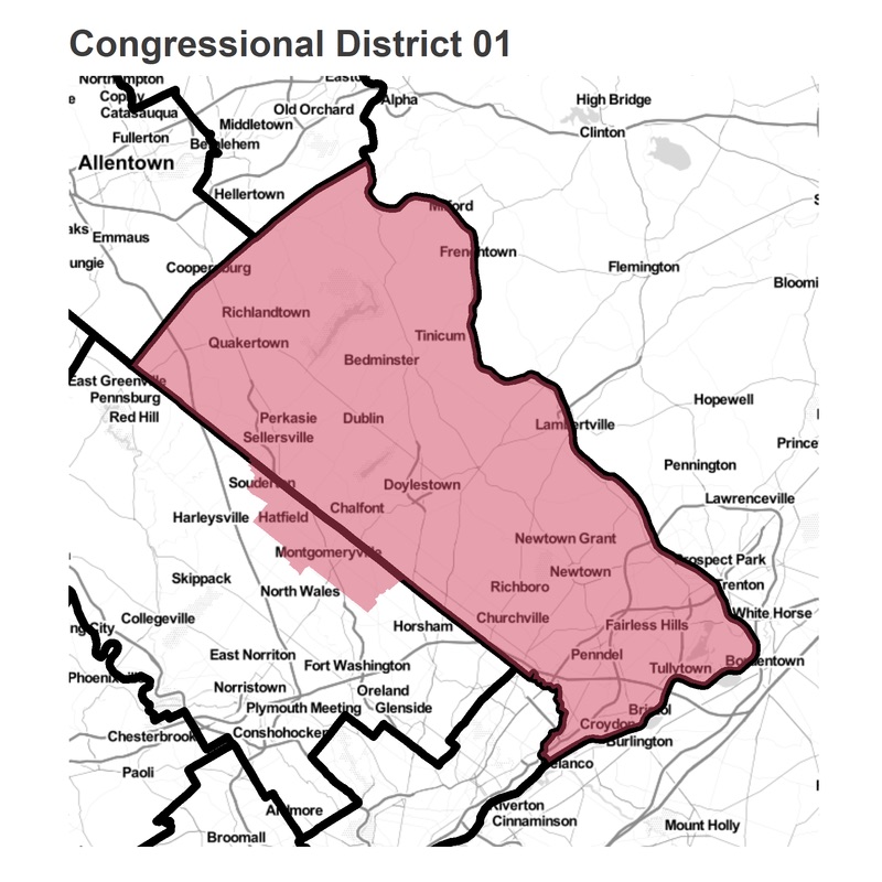
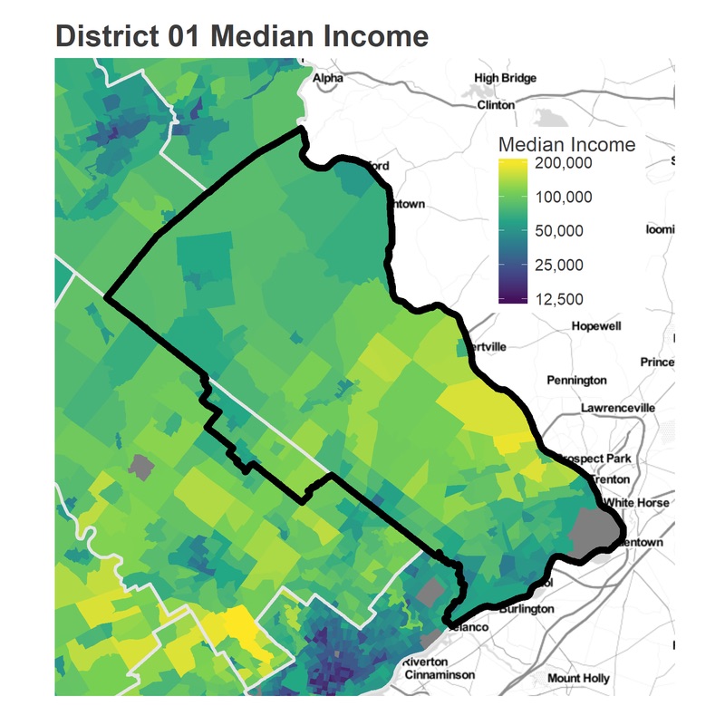
About District 1: District 01 mostly aligns with Bucks County, to the Northeast and North of the city. To accomodate the equal population requirement, it adds on Montgomeryville and Hatfield in Montgomery County.
The Incumbent: Bob Brady (D)
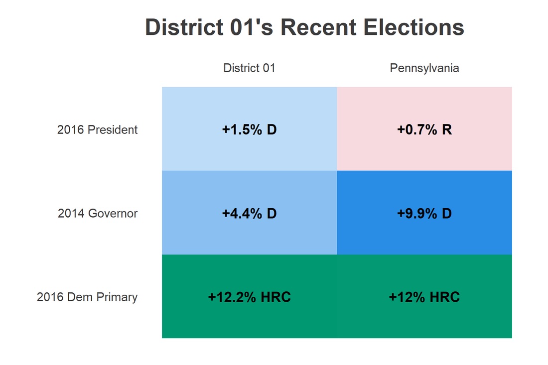
How it Leans: The district is the most evenly split in the Philadelphia region. It voted narrowly for Clinton in 2016, by a slim 50.7 – 49.3 margin. This was gap was two percentage points more Democratic than the state as a whole, though the District was 5.5 point *less* Democratic than the state in 2014.
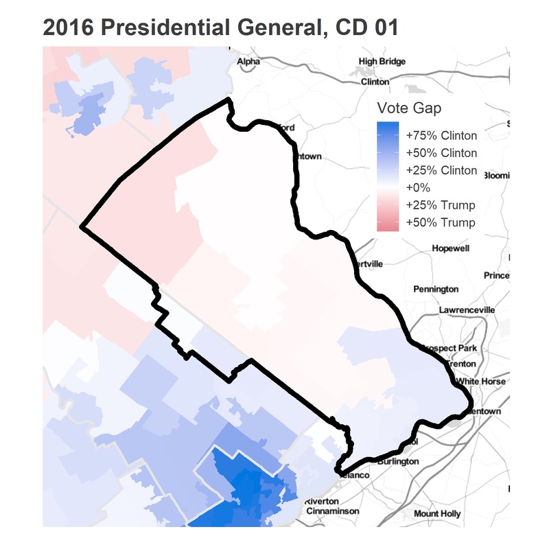
Bucks County provides the prime example of a suburban swing district, with traditional Republicans who swung against Trump. (Of course, the swing did not include all Republican voters by any means, but in this district a few percentage points matters.)
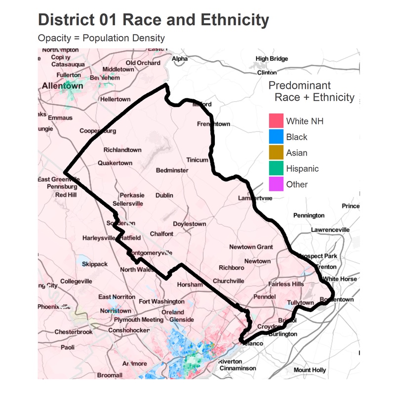
The district is predominantly White, and there is not a single State House District within it that is not at least a plurality White. Within that White population, there are demographic differences. The region immediately outside of Philadelphia looks a lot like an extension of the Northeast: it is the densest part of the County, and less wealthy than the County’s center, around Doylestown. The lowest five statehouse districts, including Newtown, Churchville, and everything below, constitutes a whopping 46% of the population.
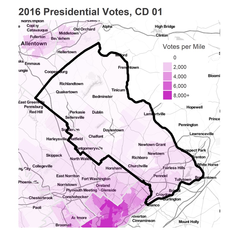

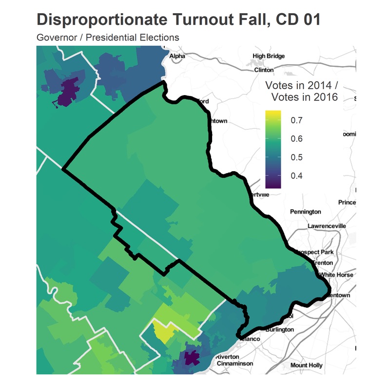
That 46% of the population turns out at lower rates than the rest of the District, and only represents 42% of the votes. But in a district so evely divided, subtle swings in any region with 42% of the vote (and especially a turnout increase, which is plausible in district with such low baseline turnout) can determine the election.

Despite the low turnout South of the district, the District as a whole votes at much higher rates than the state. Measured as votes per population over 18, the district voted at a rate nine percentage points more than the state in 2016, and six points more in 2014, the last race for Governor.
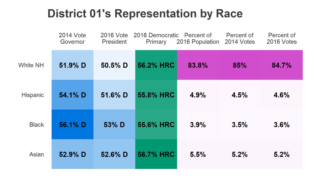
The 2016 Democratic Primary illustrates some interesting splits. Consider the wealthy region around Newtown and Lambertville. It has very high turnout, and was evenly split between Clinton and Trump. However, voters there *strongly* supported Clinton over Sanders. In other districts, we’ve seen a correlation between support for Sanders and support for Trump, which I’ve interpreted as an anti-establishment (or anti-Clinton, depending on your reading) sentiment. However, these wealthy voters appear to be legitimate centrists: with a slight overall Republican lean, who voted against Sanders, while also swinging slightly against Trump.

Below are the racial splits for the District, though they deserve a strong word of caution. The calculation below assigns races the weighted average of the vote in the State House districts that residents live in. In a District so heavily White, the Black, Hispanic, and Asian residents will still live in a predominantly White district, so the differences between races presented will be understated.
This wraps up the Philadelphia District Profiles. The redistricting removed the gerrymandering that was fabricating Republican Districts out of a broadly Democratic region. The result is that every one of the five compact districts in the region would have voted for Clinton in 2016, ranging from narrow victories (today’s CD 01) to the Democratic strongholds in the state (CDs 02, 03). While the state as a whole still represents a disproportionate Republican overrepresentation–Republicans would have won 56% of these districts in 2016, when they won only 50% of the vote–they are dramatically closer to matching the popular vote.
A note about methodology:
I use data from the Open Elections Project (www.openelections.net). I aggregate their results to the State House boundaries, which are provided by the Census and which I accessed using the tidycensus package. When one of the new districts cuts a State House district into pieces, I apportion the votes to that district by calculating the 2010 population of the overlapping area, and distribute a State House District’s votes proportionately. This is equivalent to assuming that all voters in a State House District vote similarly, which is not a bad assumption when the State House Districts are much smaller than the Congressional Districts.
The racial tables show the average vote of the districts in which residents of that race live. This is not the same as knowing that residents of that race voted that way. If 500 residents of a State House District are Asian, and that district voted 60 percent for Clinton, 40 percent for Trump, I assume that those residents voted 60-40 for Clinton. This would not be true if within districts, racial groups vote systematically differently. This assumption works best when (a) the State House Districts are small relative to the Congressional Districts and (b) a racial group is well represented. When a racial group only has low representation, this will make the differences between the groups seem smaller than they actually are.
Jonathan Tannen is an urban demographer who operates the blog sixty-six wards, where this analysis originally appeared.